Alright, let’s cut to the chase! Do you catch every lead hitting your website or sales funnel? That’s potential cash waiting to roll in. We’re not just talking clicks; we’re talking cold, hard revenue! And in today’s cutthroat market, you can’t afford to let a single lead slip through the cracks. I will show you how to optimize sales funnel in all aspects.
From sleek designs to killer follow-ups, we’re on a mission to turn every click into a cha-ching! No fluff, just practical, hands-on strategies to turbocharge your site and funnel. So strap in tight, because we’re diving deep into the art of conversion.
Table of Contents
- Enhancing Page Design
- Crafting Compelling Copy
- Creating Compelling Calls to Action (CTAs)
- Form Optimization
- Building Trust
- Optimizing for Mobile ExperienceL
- Optimizing Page Load Speed
- Implementing A/B Testing
- Effective Follow-Up Strategies
- Conclusion
Ready to turn those leads into cold, hard cash? Let’s make it happen!
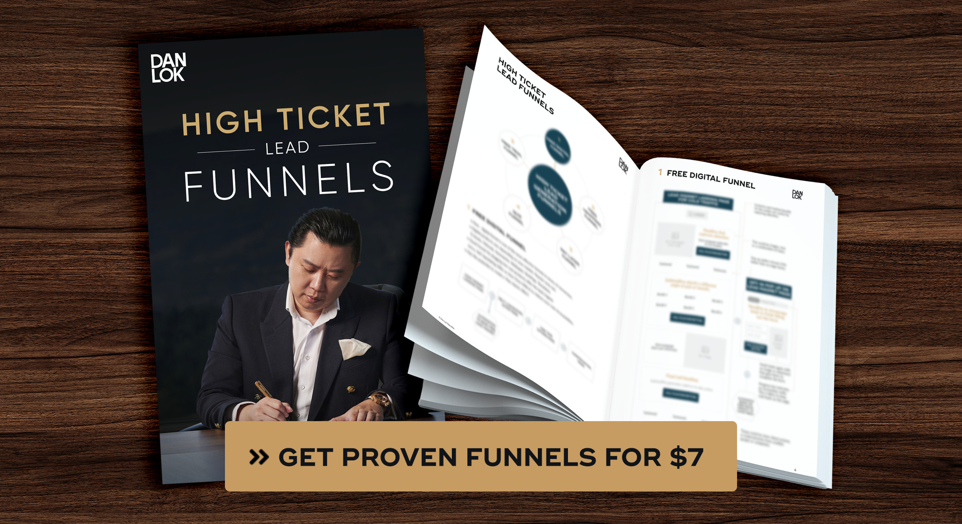
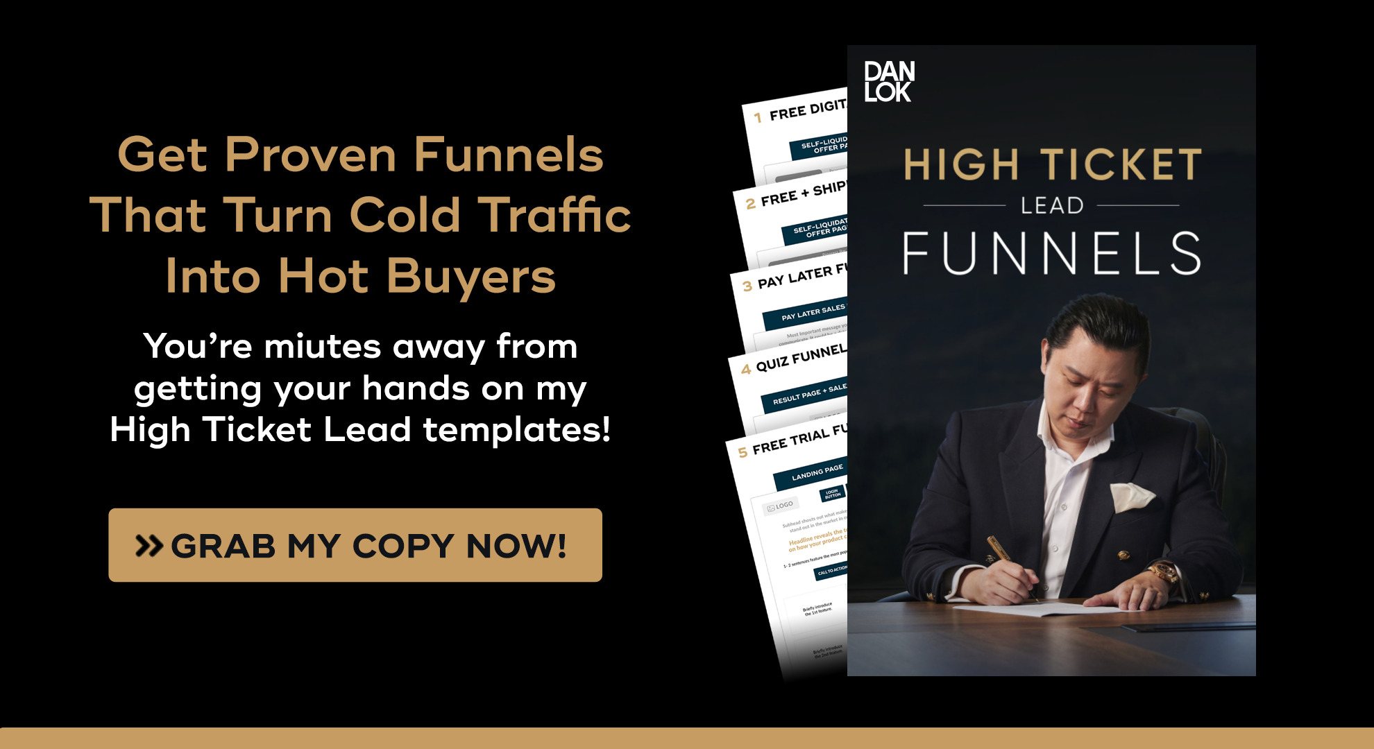
If you are about to make changes to your Sales Funnels grab a copy of my proven funnel blueprints to turn ice-cold strangers into hot hungry buyers? With “High Ticket Lead Funnels” you get the exact layouts I’ve used to ignite buying frenzies time and again. Just plug in your creative, and watch as famished buyer leads storm your business!
-
Enhancing Page Design
In the digital realm, first impressions matter. A visually appealing and user-friendly design sets the stage for a positive user experience and can significantly impact conversion rates.
-
Optimize Layout, Colors, and Typography
A good layout guides users smoothly through your content. Keep it clean and functional, with plenty of whitespace for easy reading. Colors matter too; pick ones that match your brand vibe and evoke the right emotions.
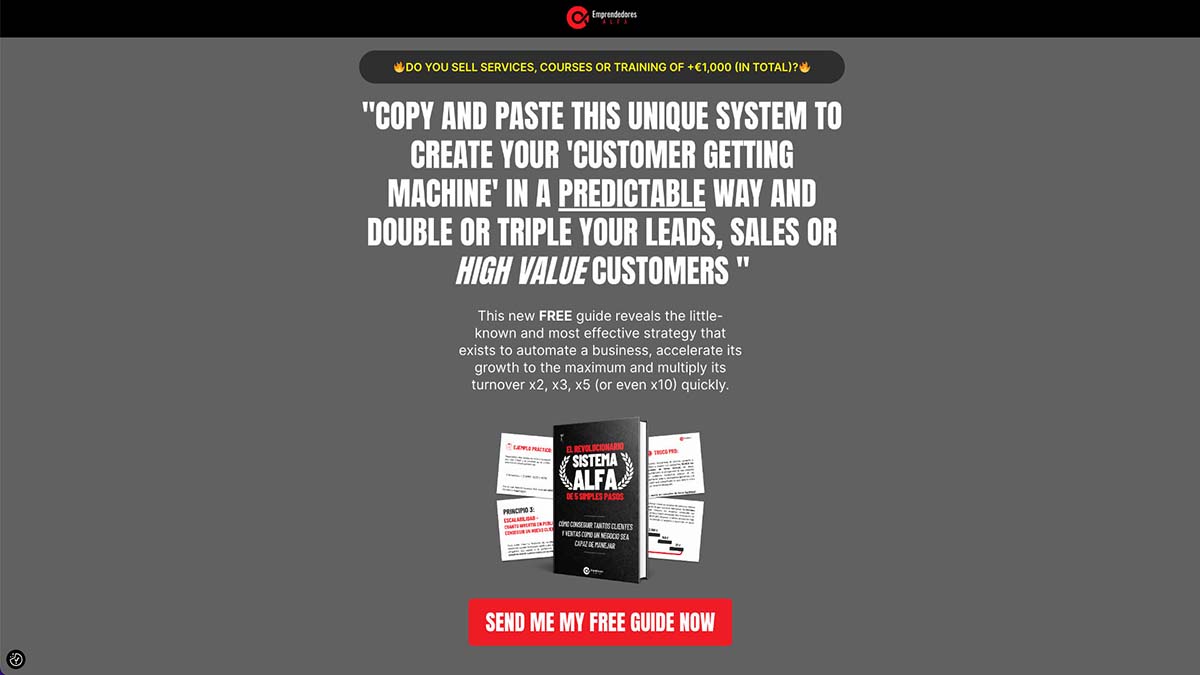
Scale Secrets from Emprendedores Alfa. It keeps the lines in the middle and leaves the area for the left and right side. It is to read and feel unpacked on the page.
When it comes to typography, keep it simple yet stylish. Go for easy-to-read fonts that match your brand’s personality. Think clean sans-serif for body text and bold serif for headlines. It’s all about keeping things clear, consistent, and engaging.
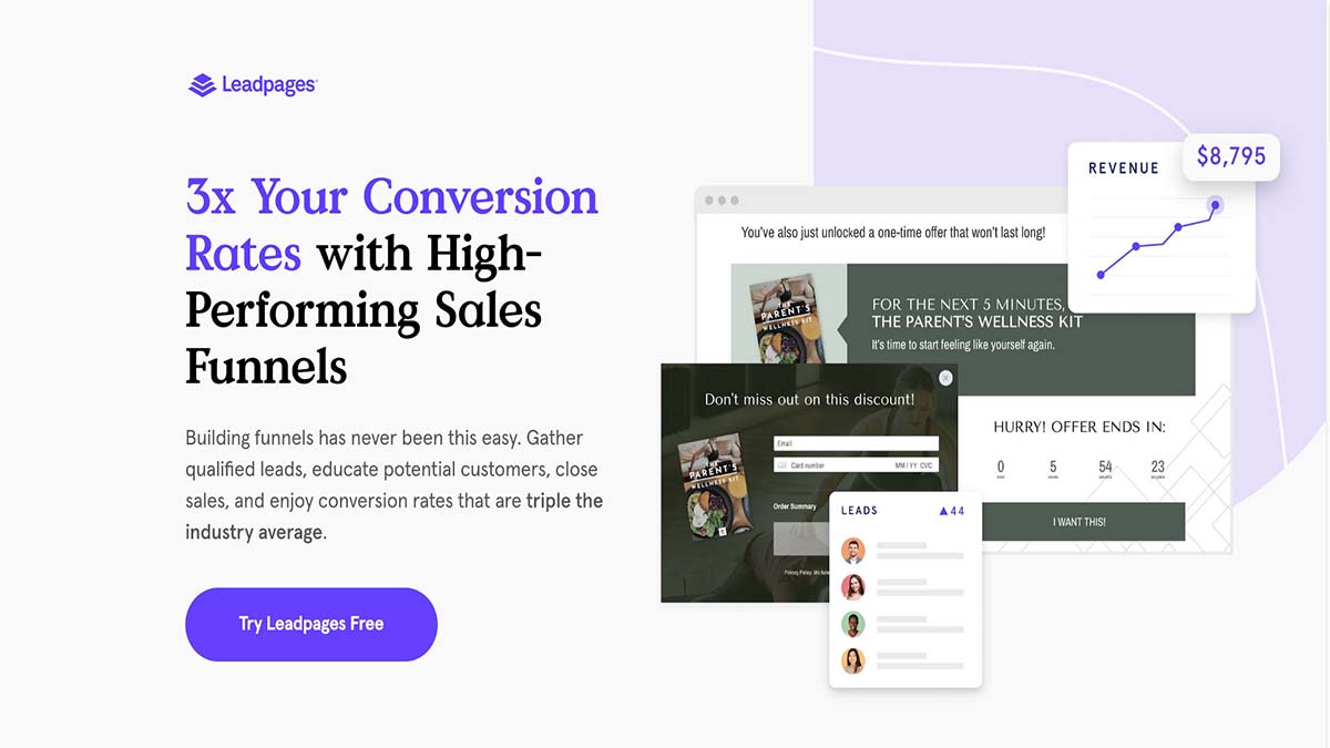
Leadpages. The page is done with sans-serif. It makes the page easy to read and stylish.
-
Incorporate Visual Hierarchy
By strategically arranging elements on the page based on their importance, you can direct users’ focus towards key messages, calls-to-action, and essential information. For example, using larger font sizes, bold text, or vibrant colors for headlines and titles can make them stand out and capture users’ attention first. Subheadings and bullet points can then provide additional context and support, guiding users through the content hierarchy.
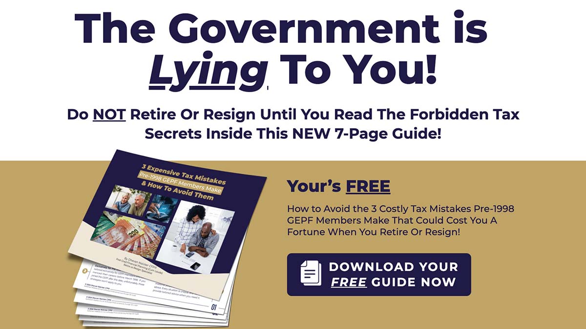
Ultimate Resignation Success Strategy from Retirement Wellness SA. There is a clear hierarchy on headline, subheadings. Also parallel bullets with testimonials, which make readers get the required information easily.
-
Utilize Visual Storytelling
Visuals are where it’s at. Don’t just dump text on your page; bring it to life with images, videos, and graphics. Show, don’t just tell. Imagine a video testimonial from a happy client on your coaching site, sharing their success story. Boom! Instant connection.
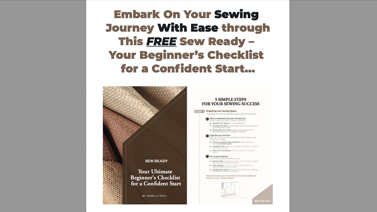
Sew Ready – Your Ultimate Beginner’s Checklist For a Confident Start from Sew Smart. It shows parts of the lead magnet on the page directly. It brings readers clarity and sets the right expectation on the content.
And don’t forget those handy infographics and diagrams to simplify the tough stuff. Visual storytelling is the secret sauce to grab attention and make your message stick.
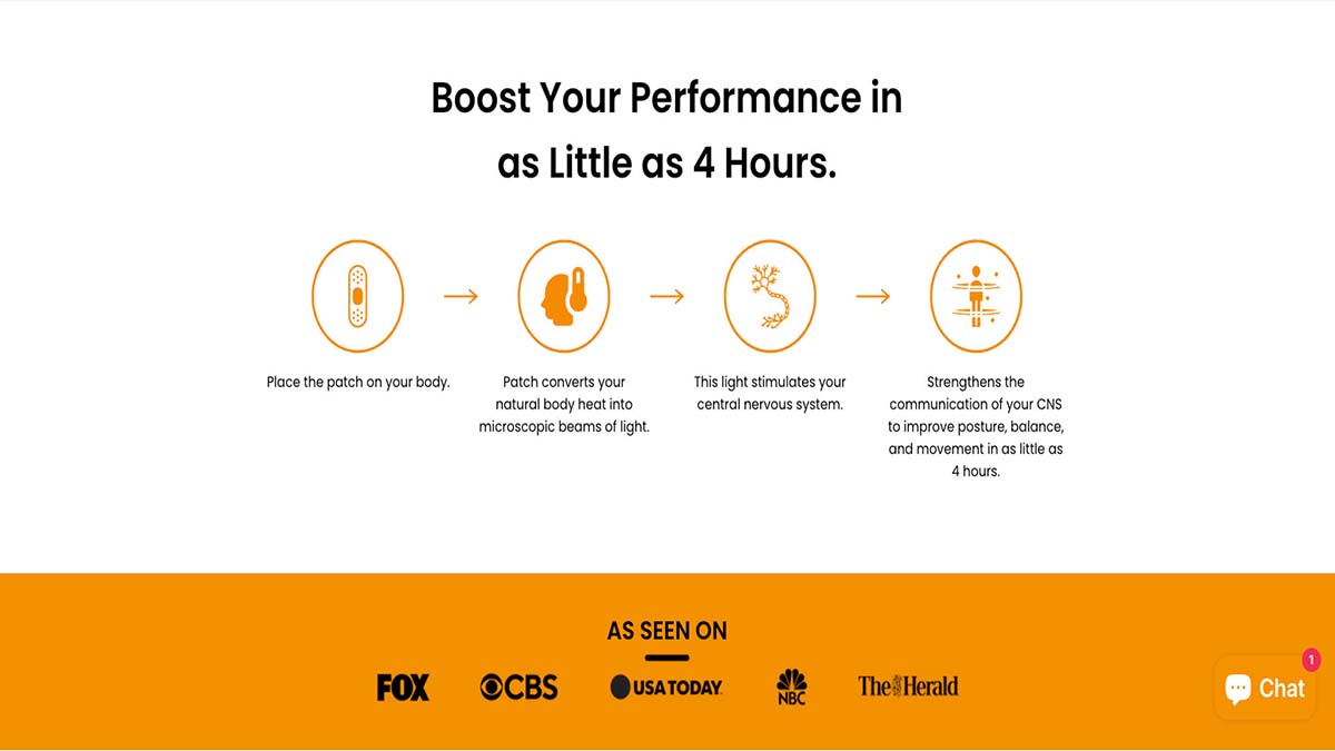
Taopatch. It incorporates a visual diagram and a video presentation to elucidate the product’s functionality and its potential benefits. These visual aids simplify complex medical information so readers comprehend the product immediately.
Are clunky funnels and confusing page designs strangling your sales? Break free with my High Ticket Lead Funnels! You’ll get 4 exquisitely engineered funnel templates scientifically structured to captivate and convert. Simply plug in your unique offers and creatives, then bask in funnel perfection as rabid buyers kick down your digital door!
-
Crafting Compelling Copy
Compelling copy is the backbone of persuasive marketing. By crafting headlines, subheadings, and body copy that resonate with your audience, you can effectively communicate your value proposition and drive action.
-
Write Persuasive Headlines and Subheadings
Your headline needs to pack a punch, selling your product’s value in a nutshell. Use strong words to hook them and keep them curious. Subheadings break things down, making info easy to chew on. Sprinkle in persuasive language, highlighting the goodies, and guide them through.
Think “Transform Your Business with Proven Strategies” for your headline, with subheads like “Unlock Growth Opportunities” and “Maximize ROI.” That’s how you reel them in and keep them hooked!
-
Highlight Benefits and Address Pain Points
Show them what you got. Highlight the benefits loud and clear, so they know what’s in it for them. Find out what’s bugging them and offer your solution on a silver platter. Use words that hit them in the feels, painting a picture of the awesome results they’ll get.
Selling a productivity tool? Tell them how it’ll make their life easier, cutting out the stress and boosting efficiency. Or selling online fitness coach programs? Show them you provide personalized workouts, keep them motivated , no matter how busy their schedule.
-
Ensure Clarity and Concision
Alright, let’s get real. Keep it snappy. No need for fancy talk or repeats. Break it down, use lists, and stay on track. Cut the jargon, keep it simple, and stick to the good stuff.
Let’s say you’re promoting a new meal delivery service. Instead of saying: “Our innovative meal delivery service offers a wide selection of chef-curated, gourmet meals made with high-quality ingredients, conveniently delivered to your doorstep.”
You could ensure clarity and concision by saying: “Get gourmet meals delivered to your door. Easy, delicious, and hassle-free.”
-
Creating Compelling Calls to Action (CTAs)
A compelling call to action (CTA) is essential for guiding users towards the desired action, whether it’s making a purchase, signing up for a newsletter, or booking a consultation.
-
Characteristics of Effective CTAs
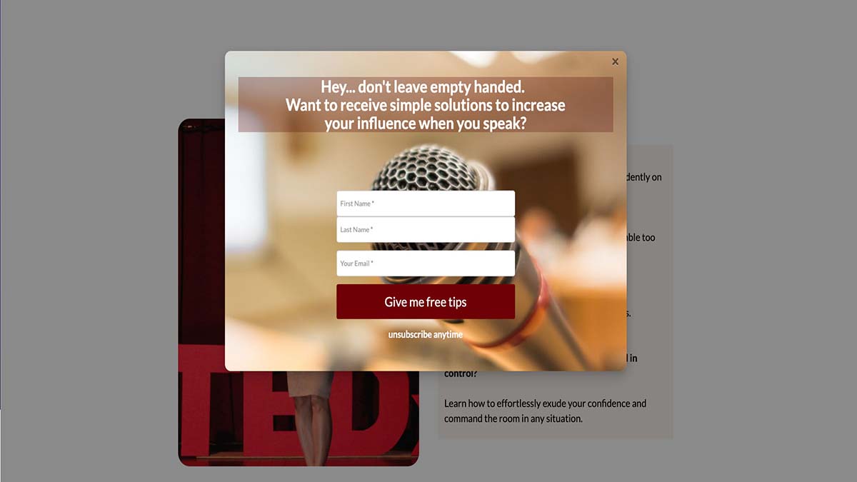
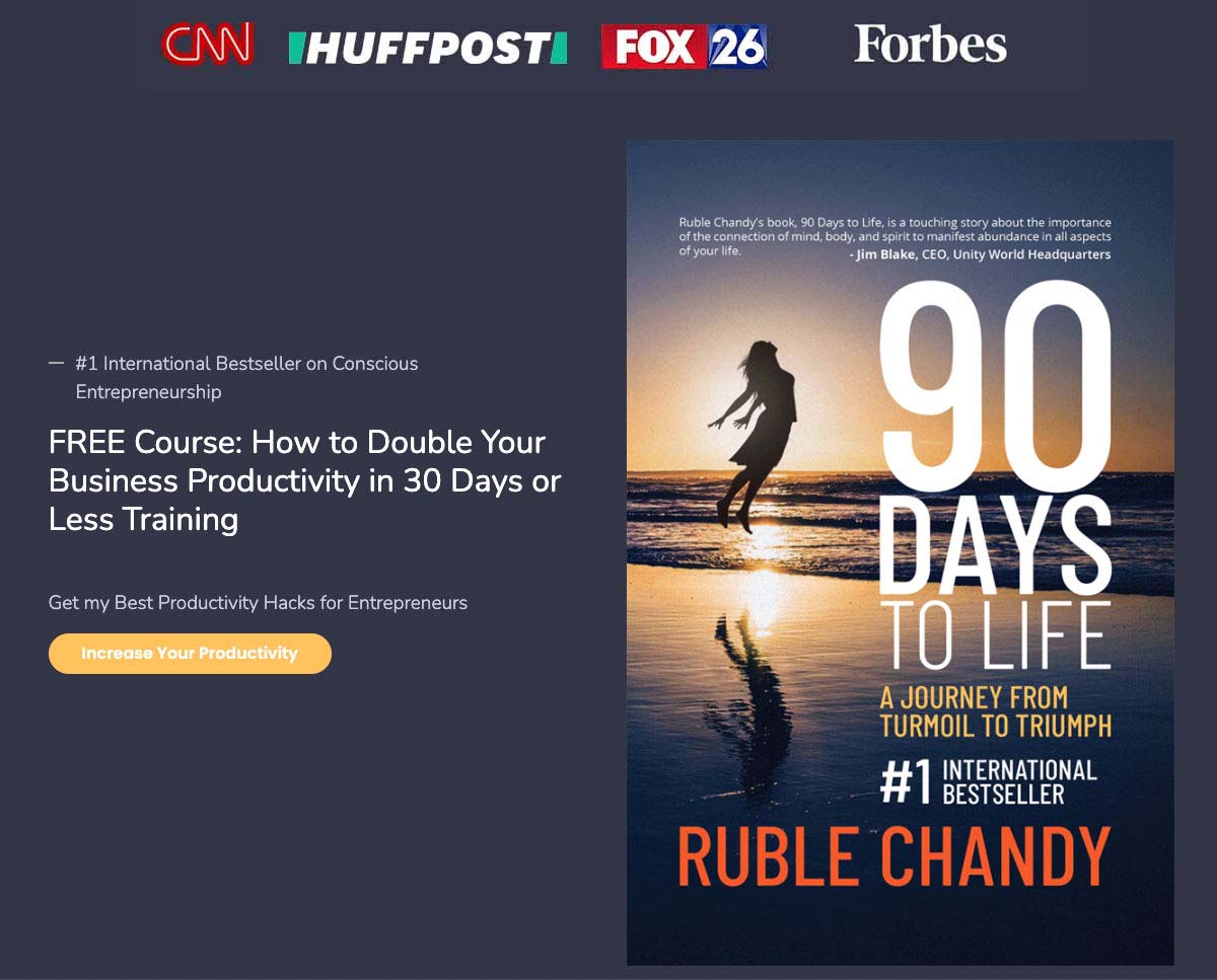
Your CTA needs to be crystal clear and to the point. Use language that gets them moving, whether it’s signing up, downloading, or buying. Make those CTAs pop with bold colors and strategic placement. Test, tweak, and track to find the sweet spot that gets those clicks rolling in!
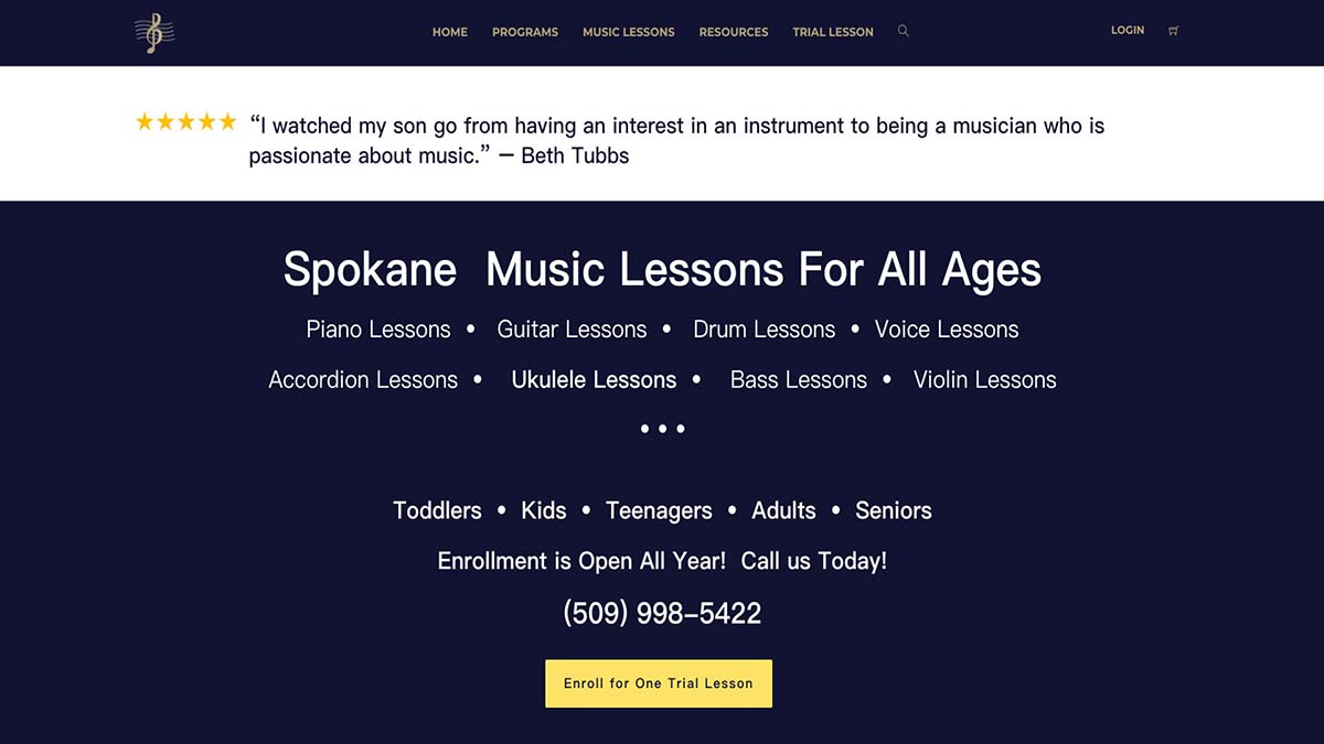
Bartell Music Academy
Georgina Chang
Ruble Chandy
-
Placement Strategies
CTAs should be strategically positioned throughout your website or sales funnel to ensure they are easily accessible and visible to users at key decision points. Consider placing CTAs prominently above the fold, where they are immediately visible without the need for scrolling.
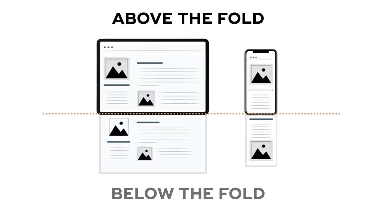
Also, incorporate CTAs strategically within your content, aligning them with relevant information and compelling users to take action based on the context of the content they are reading.
-
Utilizing Persuasive Language and Urgency
Use compelling verbs and adjectives that encourage users to click on the CTA and engage further with your content or offering such as “Unlock exclusive access”, “Discover your potential”, “Transform your life today”, “Claim your spot”.
And don’t forget urgency—make them feel like they gotta act now to snag that deal. “Limited Time Offer”, or “Act Now” – make them feel the FOMO and watch them jump into action!
-
Form Optimization
Forms are a critical component of many sales funnel pages, allowing users to submit their information and take the next step towards conversion. However, long or complicated forms can deter users and lead to high abandonment rates.
-
Streamline Form Fields
Less fields mean less hassle for users. Start by evaluating each form field and considering whether it’s necessary for achieving your conversion goals. Cut out the fluff and keep only what’s necessary.
Furthermore, use smart form design techniques such as progressive disclosure, where additional fields are revealed based on user input, to break longer forms into smaller, more manageable sections.
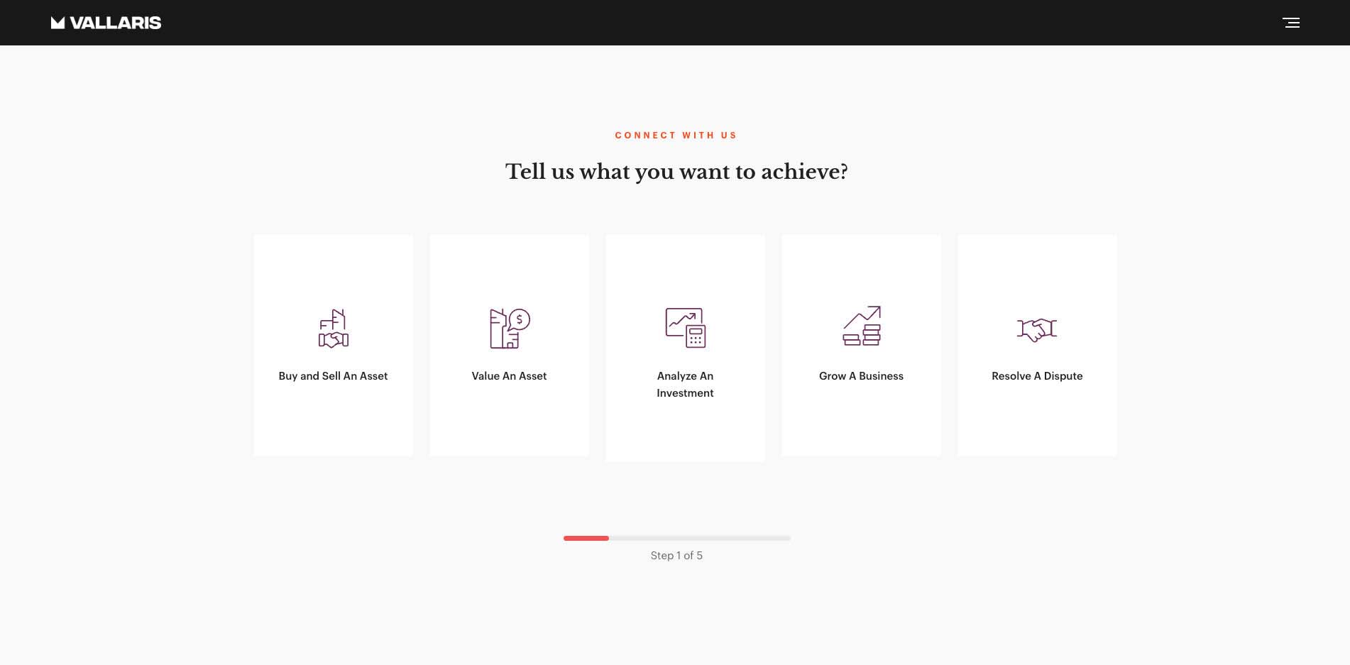
Vallaris Private Limited. The form fields are easy to understand with icons. It splits questions into a single card without overwhelming users by multiple questions on one page; it also shows the progress bar on the bottom, which lets users know how many questions to answer.
-
Implement Inline Validation
Inline validation gives users instant feedback on any errors as they fill out the form, so they can fix them on the spot. No more frustration, just smooth sailing to submission. Picture this: You enter an invalid email, bam! Instant messages pop up, guiding you to fix it. Throw in some color changes or icons for extra clarity, and you’ve got yourself a user-friendly form that’s a breeze to fill out!
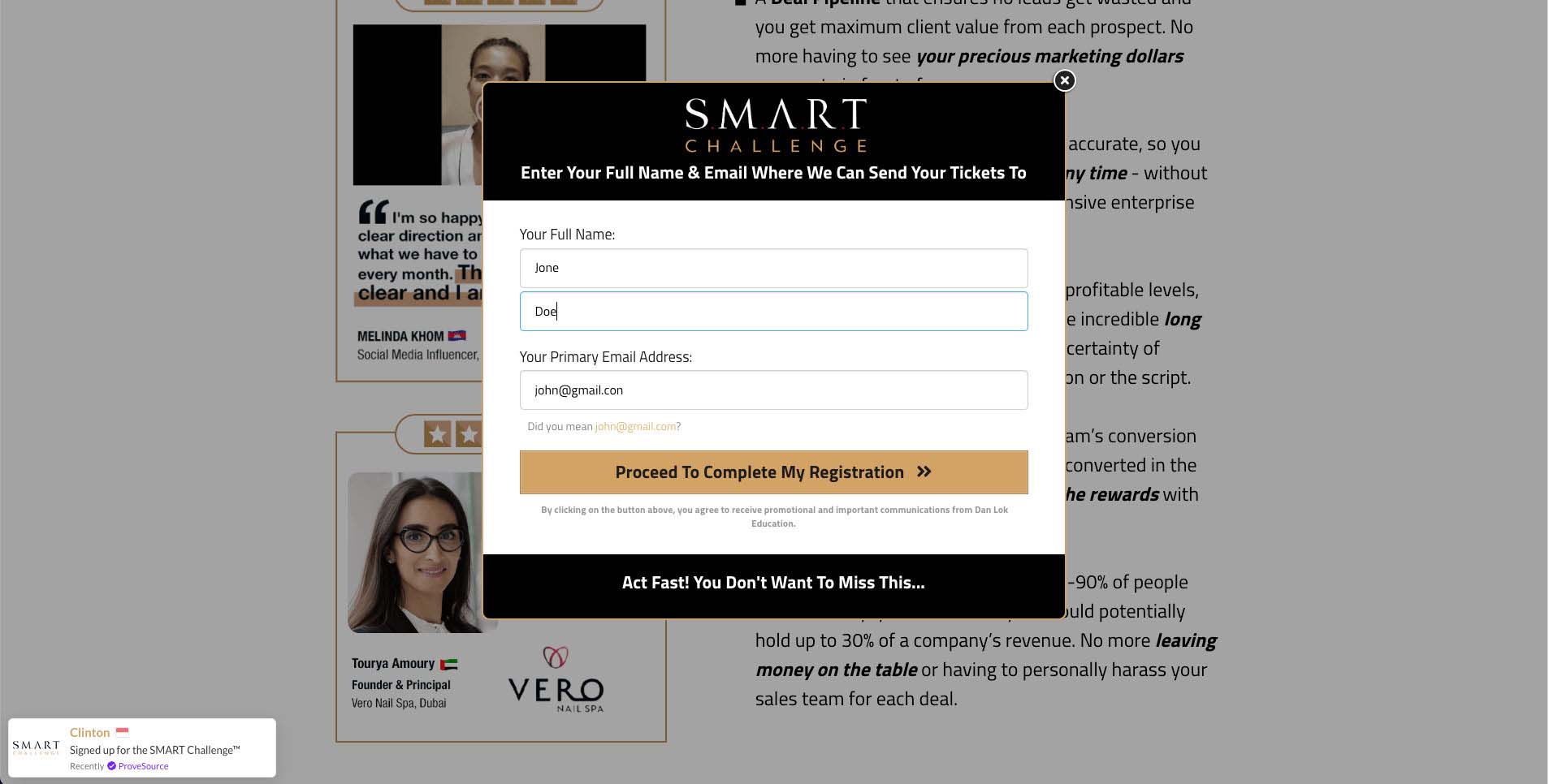
SMART Challenge from Dan Lok Education. The validation shows the visitor input the wrong email format. This prevents further email failed delivery.
-
Use Auto-Fill and Pre-Filled Data
Auto-fill and pre-filled data are absolute lifesavers for form completion. They do the heavy lifting for users by filling in info based on past interactions. Think names, emails, addresses—all done in a snap! Less typing, fewer errors, and a smoother ride for users. It’s like magic, making forms a breeze to fill out!
-
Building Trust
Trust is a fundamental element of any successful sales funnel. Users are more likely to convert if they trust your brand and believe in the value of your offering.
-
Incorporate Trust Signals:
You’ve got options: customer testimonials, reviews, trust badges, endorsements and certifications. Authentic testimonials from happy customers? Gold! They back up your claims and show your stuff works. Positive reviews from trusted sources? Even better! And those trust badges? They scream “safe and secure.” Plus, flaunting industry certifications? That’s your commitment to top-notch quality and professionalism.
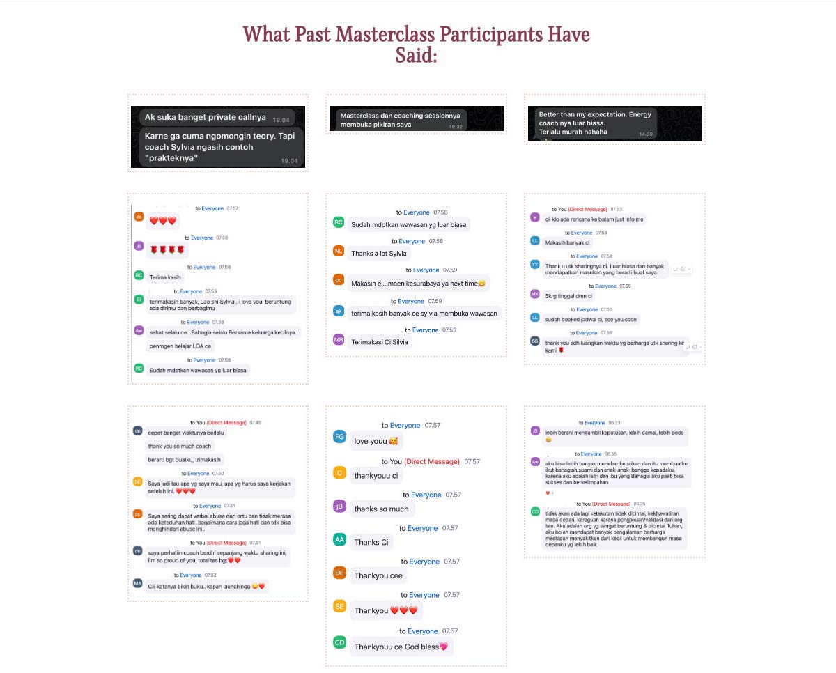
I Love You and I Love Me MORE Masterclass from Sylvia Silvers. It uses customer reviews as proof of trust.
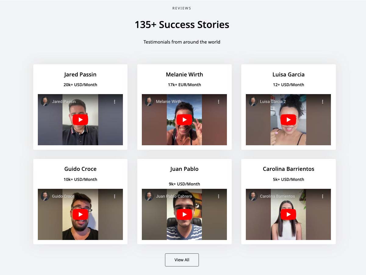
Markus Dunk. Videos are one of the most powerful testimonials.
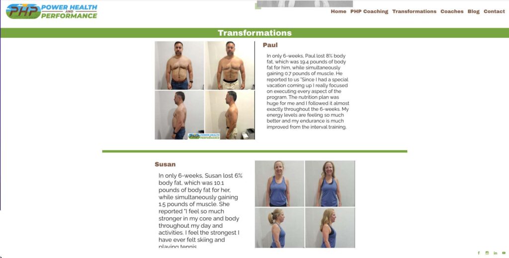
Power Health and Performance. Test case shows how you can help clients directly.

MART Challenge from Dan Lok Education. Endorsements from big brands are helpful.
-
Effectively Displaying Trust Signals
First up, scatter them strategically across your page—near those action points like CTAs or contact forms. Make them stand out, bold and clear. Next, give testimonials a prime spot. Dedicate a section with visuals—pics, vids, you name it.
Lastly, don’t stop at the landing page! Keep those trust vibes flowing through the whole funnel—confirmations, thank-yous, even follow-up emails.
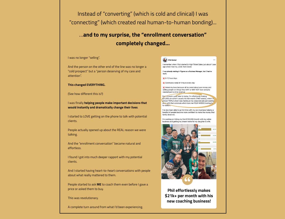
More Sales Challenge from Dan Lok Education. It displays one client’s review aside from a paragraph and above the call to action button as an illustration.
What if you could quit guessing where to place testimonials, CTAs, and sales elements – and instead, wield funnel optimization secrets from a master? With High Ticket Lead Funnels, you’ll get my optimized funnel blueprints that magnetically draw prospects in and practically force them to whip out their wallets! Transform your funnel into a well-oiled machine now.
-
Optimizing for Mobile Experience
With the increasing prevalence of mobile devices, it’s essential to ensure that your sales funnel pages are optimized for mobile experience. Here’s how to make sure your pages are mobile-friendly:
-
Implementing Responsive Design
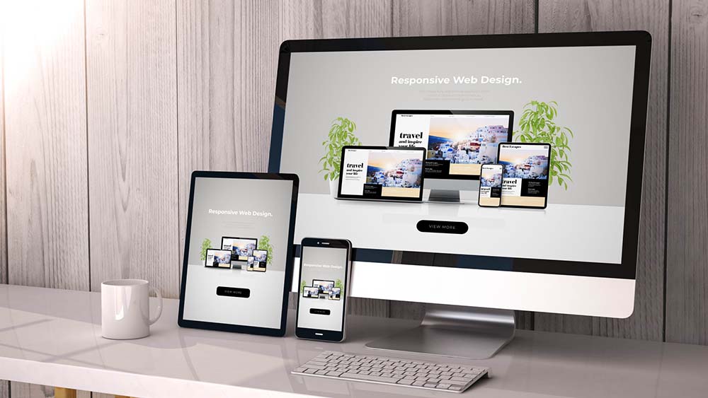
Your sales funnel needs to be responsive, period. That means it looks good and works well whether your users are on a phone, tablet, or desktop. No squinting, no pinching—just smooth sailing on any device. When your site looks great and functions flawlessly, no matter where your users are, you’re golden! Here is one blog that guides you responsive web designs.
-
Prioritize Content
Think small, but mighty. On those tiny screens, less is more. Keep it short and sweet—cut the fluff and get straight to the point. Use collapsible menus or accordions to tuck away extra info, so it’s there when users need it, but not cluttering up the screen. Maximize that limited space while still giving users what they need, when they need it!
-
Ensuring Touch-Friendly Elements
Let’s talk about touch-friendly design! Think big and spacious—your buttons and menus need room to breathe. Make them big enough to tap with ease and give them some elbow room so users don’t accidentally hit the wrong thing. It’s all about making the experience smooth and intuitive, so your users can navigate with a flick of the finger!

-
Optimizing Page Load Speed
In today’s fast-paced digital world, users expect instant gratification. A slow-loading page can frustrate users and drive them away, resulting in lost opportunities for conversion.
-
Techniques for Improvement
Image optimization is key—compress those pics and use responsive formats to keep things zippy. Trim the fat from your CSS and JavaScript files—less code means faster load times.
And hey, don’t forget about browser caching! Storing stuff locally cuts down on server time, so your pages load in a flash. Check this blog for more details on improving your page speed.
-
Importance of Testing and Monitoring
Regularly test and monitor your page load speed using tools like Google PageSpeed Insights or GTmetrix. Identify areas for improvement and implement changes to optimize load speed continually.
Sick of average results in your funnel? Grab a copy of “High Ticket Lead Funnels” today! You’ll get a set of proven funnel blueprints that turn ice-cold traffic into blazing hot buyer leads on autopilot. Simply add your creative to the templates, hit go, and boom – an automated money-printing machine is born! No confusion, just revenue. But don’t wait, this promotion might change at any time.
-
Implementing A/B Testing
A/B testing, also known as split testing, is a powerful method for optimizing your sales funnel pages by comparing different variations to determine which performs best. Here are some tips to implement A/B testing.
-
Start with Clear Objectives
Get focused! A/B testing is all about hitting those targets dead-on. Define your goals upfront—whether it’s boosting Conversion Rate, Click-Through Rate, or Average Order Value. When your testing is laser-focused, you’ll get insights that pack a punch and results you can actually use.

-
Test One Variable at a Time
Testing one thing at a time is key. By isolating each element, you can see exactly how it affects your conversion rates or user behavior. No confusion, no mixed signals—just clear results that tell you what’s working and what’s not. It’s all about keeping it simple and focused for maximum impact!.
-
Use Large Enough Sample Sizes
Ensure that your A/B tests have statistically significant sample sizes to draw meaningful conclusions. Testing with too small a sample size can lead to unreliable results and inconclusive findings. Use statistical significance calculators to determine the necessary sample size for your experiments. These 2 tools help you calculate what sample size you need: Optimizely, Unbounce.

-
Effective Follow-Up Strategies
Effective follow-up strategies are essential for nurturing leads and guiding them through the sales funnel towards conversion. Here are some strategies to implement effective follow-up communication:
-
Implementing Automated Email Sequences
Picture this: a lead signs up after clicking your ad. Bam! You hit them with a welcome email—friendly, inviting, and packed with value. Then, keep the momentum going with a series of follow-up emails—maybe a helpful tips newsletter or a special offer tailored just for them. It’s all about staying engaged and guiding those leads toward conversion, one email at a time.
Check this blog for 20 best examples on email subject lines that get opened

-
Leveraging Retargeting Ads
You’ve got those leads who’ve checked out your site or clicked your ads but haven’t hit that “buy” button yet. No worries! Set up those retargeting campaigns and get back in front of them, wherever they roam on the web.
Think personalized ads popping up on Facebook or Google, reminding them of what they’re missing out on. It’s like giving them a gentle nudge back toward your awesome offers. Ready to reel ’em back in? Let’s make those retargeting campaigns shine!

-
Conclusion
Let’s wrap it up! Optimizing your sales funnel pages means covering every angle.
- Optimizing your page design
- Crafting compelling copy
- Utilizing powerful Call To Actions
- Making an easier form
- Collecting visitors’ trust
- Enhancing mobile experience
- Improving page load speed
- Applying A/B testing
- Ensuring follow-up strategically

