Welcome to our latest blog, where we dive into the best channels for finding potential clients for boosting your pipelines in B2C, C2C, and D2C. This one’s inspired by Christian, who asked a fantastic question in our newsletter: “How can I boost my pipeline?”
Having a variety of channels is key to keeping your pipeline flowing. It’s like casting a wider net—you’ve got a better shot at finding more potential clients and turning them into clients. The trick is knowing which channels work and how to use them effectively.
That’s where this blog comes in. I’ve gathered proven strategies and effective channels to help you maximize your outreach and fill those pipelines. Let’s get started on expanding your reach and taking your pipeline to the next level!
This blog is focused on Business-to-Consumer, Consumer-to-Consumer, and Direct-to-Consumer models. If you’re into B2B, B2G, or D2D, don’t worry—I’ve got you covered in this blog post.
Table of Contents
- Channels and Strategies for Business-to-Consumer (B2C)
- Channels and Strategies for Consumer-to-Consumer (C2C)
- Channels and Strategies for Direct-to-Consumer (D2C)
- Conclusion
Do you need to build a reliable way of getting more High Ticket Clients?
Download my High Ticket Client Cheat Sheet. It’s my time-tested formula based on my billion business. It covers High Ticket offers creation, mindsets you should shift to boost your business, High Ticket closing secrets to maximize your sales. Don’t miss out any chance to prosper your business.

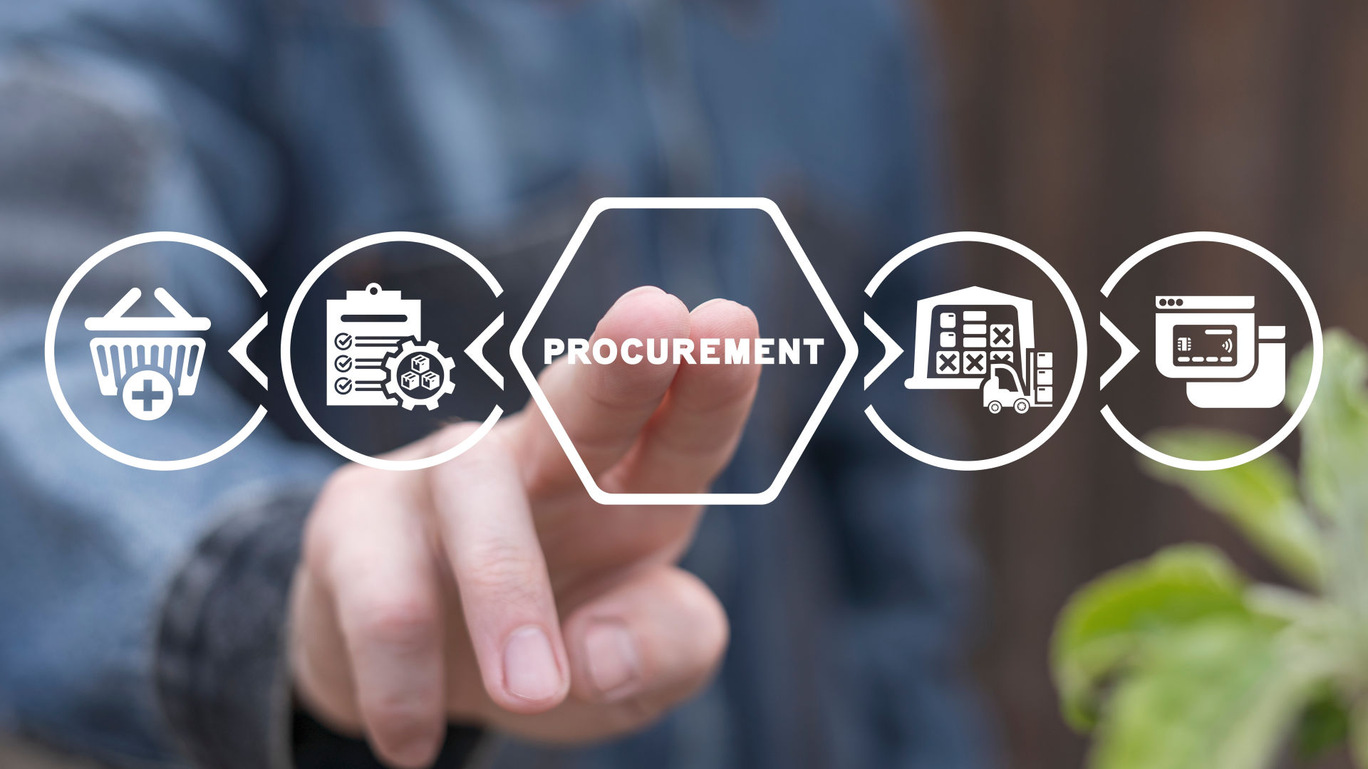
Finding Potential Clients in Business-to-Consumer (B2C)
In the realm of B2C (Business-to-Consumer) transactions, maximizing your pipeline is paramount for sustained growth. Let’s delve into 4 channels and 20 effective methods to enhance your B2B pipeline and drive success.
1. Influencer marketing
Collaborate with influencers in your niche to reach a wider audience. Here are some types of campaigns that you can run as part of their influencer marketing efforts
- Product Reviews
Collaborate with influencers to review your products or services on their platforms. Authentic and unbiased reviews from trusted influencers can help build credibility and trust with their audience. - Brand Ambassadorships
Establish long-term partnerships with influencers to serve as brand ambassadors. Brand ambassadors consistently promote your products or services over an extended period, helping to build brand awareness and loyalty among their audience. - Sponsored Content
Pay influencers to create sponsored posts, videos, or other content featuring your brand. Sponsored content allows you to reach a wider audience and control the messaging and visuals associated with your brand. - Event Collaborations
Partner with influencers to promote or host events such as product launches, store openings, or exclusive VIP experiences. Influencers can help drive attendance and generate buzz around the event. - Content Co-Creation
Collaborate with influencers to co-create content such as blog posts, videos, or podcasts. Co-created content allows you to leverage the influencer’s creativity and expertise while aligning with your brand messaging and goals.
2. Content marketing
By incorporating a diverse mix of these content types into their marketing strategy, businesses can effectively generate more opportunities.
- Blog Posts
Written articles published on a company’s blog or website, covering a wide range of topics related to the industry, products, services, trends, tips, and more. - Podcasts
Audio recordings in the form of episodes or series, featuring discussions, interviews, storytelling, insights, advice, and industry-related topic.
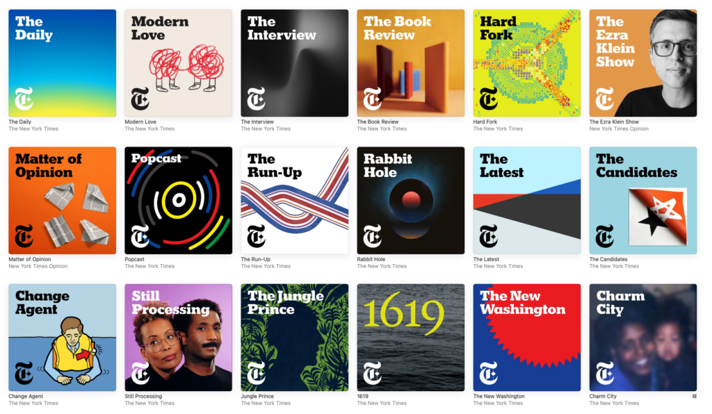
The New York Times Podcasts
- Webinars and Live Streams
Interactive online presentations, workshops, or events conducted in real-time, allowing participants to engage with experts, ask questions, and learn about specific topics or subjects. - Email Newsletters
Regularly distributed emails containing curated content, updates, announcements, promotions, offers, and other valuable information tailored to subscribers’ interests and preferences.
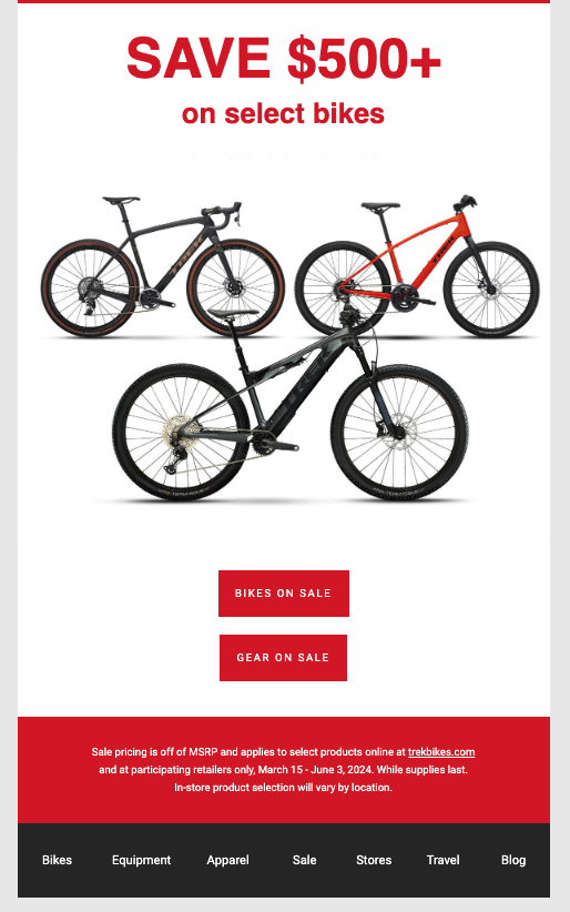
Trek Bicycle
- Ebooks and Whitepapers
Comprehensive, long-form content pieces that provide in-depth insights, analysis, research findings, guides, case studies, and best practices on specific topics or subjects.
3. Events and Trade Shows
Although more traditional, participating in trade shows, conferences, and local events can help you connect with potential customers and build relationships. It’s also an opportunity to showcase your products and services to a broader audience.

- Choose the Right Events
Select events and trade shows that align with your target audience and industry. Research attendee demographics, past exhibitors, and overall event scope to ensure it’s a good fit for your business.
- Offer Interactive Experiences
Engage attendees with interactive elements like product demonstrations, virtual reality experiences, or games. This creates a memorable experience and encourages visitors to spend more time at your booth.
- Provide Giveaways and Promotional Items
Giveaways can attract visitors to your booth. Choose useful promotional items that align with your brand. Consider branded merchandise like tote bags, water bottles, or USB drives. These can serve as reminders of your business long after the event.
- Follow Up After the Event
The follow-up process is critical for converting leads into customers. Send personalized emails, thank-you notes, or special offers to those who visited your booth. This helps maintain the connection and encourages further engagement.
- Network with Other Exhibitors
Trade shows and events are excellent opportunities to network with other businesses. Building relationships with complementary businesses or industry influencers can lead to partnerships or collaborations.
4. Search engine optimization (SEO)
By implementing these SEO strategies effectively, you can improve your website’s visibility, attract more organic traffic, and generate more opportunities for B2C sales and conversions.
- Keyword Research
Conduct thorough keyword research to identify the terms and phrases your target audience is using to search for products or services similar to yours. Focus on long-tail keywords with high search volume and low competition to attract qualified traffic.
- Optimize On-Page Elements
Optimize on-page elements such as title tags, meta descriptions, headers, and URLs to include relevant keywords and provide clear, descriptive information about your products or services. Ensure that your website content is user-friendly, informative, and valuable to visitors. - Create High-Quality Content
Develop high-quality, informative, and engaging content that addresses the needs, questions, and pain points of your target audience. Publish blog posts, articles, guides, tutorials, and videos that provide valuable insights, solutions, and recommendations related to your industry or niche. - Optimize for Voice Search
With the rise of voice-enabled devices and virtual assistants, optimize your content for voice search queries by using conversational language, answering common questions, and targeting long-tail, natural language keywords.
Check out my FREE High Ticket Client Cheat Sheet to ensure you understand the psychology of High Ticket Clients to grow your pipeline faster.

Finding Potential Clients in Consumer-to-Consumer (C2C)
In the context of C2C (Consumer-to-Consumer), maintaining a robust pipeline is essential for thriving in peer-to-peer marketplaces. Let’s dive into effective techniques to boost your C2C pipeline and keep your community engaged.
1. Online marketplaces
Utilize platforms like eBay, or Etsy to sell goods directly to consumers.
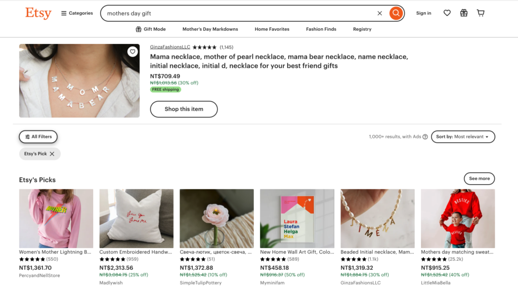
- Promotional Offers
Offer discounts or special deals to attract buyers.
For example, offer a “Buy One, Get One Free” deal on select items.
Great Custom Stuff – It provides extra 30% off
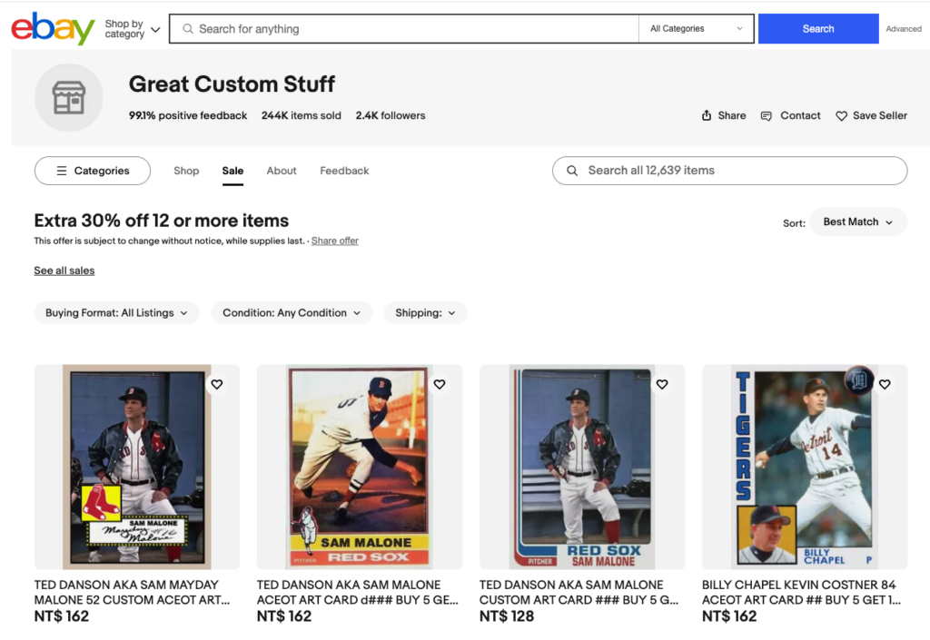
- Featured Listings
Pay to have your new product featured on the homepage of the marketplace.
GinzaDashionsLLC – It’s featured on the mothers day gift.
- Bundle Sales
Create bundles of related items and offer them at a discounted price. For example, create a bundle of a phone case, screen protector, and charger and offer it at a discounted price. - Limited-Time Sales
Create urgency by offering limited-time sales or flash deals such as a 24-hour flash sale with 30% off all items in your store. - Seasonal Campaigns
Tailor your campaigns to holidays or seasonal events to capitalize on increased shopping activity. - Sponsored Ads
Invest in sponsored product ads to appear at the top of search results for relevant keywords. - Customer Loyalty Programs
Reward repeat customers with discounts or exclusive offers to encourage repeat purchases.
For instance, offer a 10% discount on their next purchase for customers who leave a review. - Review and rating:
Encourage satisfied customers to leave positive reviews and ratings to attract new buyers.
2. Social media groups and forums
Join relevant groups or forums where consumers buy, sell, or exchange goods and services. Check below campaigns which aim to boost your opportunities.
![A Reddit post state that [serious] what is the creepiest thing that has ever ACTUALLY happened to you?](https://danlok.com/wp-content/uploads/2024/05/010.jpg)
- Community Engagement Campaigns
Encourage active participation and discussion within relevant social media groups and forums by initiating conversations, asking questions, and sharing valuable insights or tips related to your niche.
Example: Start a weekly discussion thread where members can share their experiences or seek advice on topics related to your industry. - Educational Webinars or Workshops
Host informative sessions or workshops within social media groups or forums to educate members about relevant topics or trends in your industry.
Example: Organize a live webinar where members can learn about the latest developments in your field and how they can apply them to their own projects or businesses. - Ask Me Anything (AMA) Sessions
Conduct AMA sessions within social media groups or forums where members can ask questions and interact directly with you or other experts in your industry.
Example: Host a monthly AMA session where members can ask questions about your products, services, or industry trends, providing them with valuable insights and building rapport with your audience. - Networking
Engage with like-minded individuals and potential customers within these groups and forums. By participating in discussions, sharing valuable insights, and building relationships, you can establish trust and credibility, which may lead to new business opportunities through referrals or direct inquiries.
3. Referral programs
Incentivize existing customers to refer friends and family to your products or services. Here are some effective campaigns you can implement within referral programs for C2C businesses.
- Give-and-Get Referral Incentives
Offer both the referrer and the new customer a reward for successful referrals. For example, provide a discount or credit to both parties on their next purchase or transaction.

- Limited-Time Referral Contests
Host referral contests where customers compete to refer the most friends within a specific timeframe. Offer enticing prizes such as gift cards, exclusive products, or experiences to motivate participation. - Personalized Referral Messaging
Provide customers with customizable referral messages or templates that they can share with their contacts. Encourage them to add a personal touch to the messages to increase engagement and conversion rates. - Social Media Sharing Challenges
Encourage customers to share their referral links or codes on social media platforms and track the number of clicks, shares, or conversions generated. Offer rewards or recognition for customers who actively participate in spreading the word about your business. - Exclusive Referral Clubs
Create an exclusive referral club or VIP program for top referrers, offering them additional perks, benefits, or recognition for their loyalty and advocacy. This can incentivize customers to strive for membership in the club and continue referring others.
Get my High Ticket Client Cheat Sheet for FREE. Inside, you get the high ticket mindset, irresistible offers formula and persuasion principles to seamlessly reel them across the finish line.
Finding Potential Clients in Direct-to-Customers (D2C)
In the D2C (Direct-to-Consumer) world, building a solid pipeline is key to reaching customers directly without intermediaries. Let’s explore proven ways to enhance your D2C pipeline and foster stronger customer relationships.
1. E-commerce websites and online stores
Create a robust and user-friendly D2C e-commerce website that attracts and retains customers, ultimately leading to increased sales and business growth.

- Choose the Right Platform
Select a platform that is user-friendly and provides the features you need without excessive coding or technical knowledge. Consider platforms like Shopify, WooCommerce, or Magento, which offer extensive customization and scalability.
- Design for User Experience
Ensure your website is mobile-friendly and works well on all devices. Create a simple and intuitive menu structure to help users find products easily. Optimize images, use a content delivery network (CDN), and minimize unnecessary scripts to ensure quick page load times.
- Simplify the Checkout Process
Allow users to check out without creating an account. Offer various payment methods, such as credit cards, PayPal, and digital wallets like Apple Pay or Google Pay. Use SSL encryption to secure transactions and display trust badges to build customer confidence.
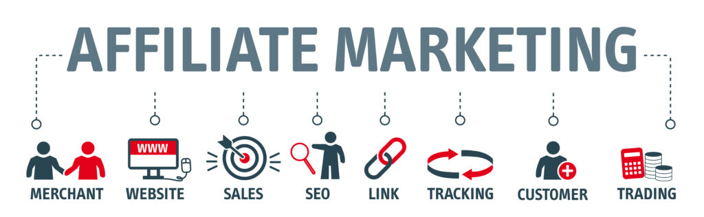
2. Affiliate Marketing
D2C brands can collaborate with affiliates who earn commissions for driving sales through unique referral links. This can expand the brand’s reach without a direct upfront cost.
- Create an Attractive Commission Structure
Offer a competitive commission rate that motivates affiliates to promote your products. Consider a percentage-based commission, a fixed fee, or a tiered structure. Provide bonuses for achieving specific milestones or promoting high-value products.
- Choose the Right Affiliate Platform
Use a reputable affiliate marketing platform, such as ShareASale, Rakuten, or CJ Affiliate, to manage your program and track performance. Ensure the platform offers custom tracking links, real-time reporting, and integration with your e-commerce platform.
- Monitor Affiliate Activities and Compliance
Establish clear terms and conditions for affiliates and ensure they adhere to your brand guidelines and marketing rules. Implement measures to detect and prevent fraudulent activities or unethical practices.
- Measure Success and Make Adjustments
Provide affiliates with regular performance reports and feedback on their efforts. Use feedback and performance data to continuously improve and refine your affiliate marketing program. Test new strategies, offers, and promotional techniques to keep the program dynamic and effective.
3. Social media marketing
Engage with your audience on platforms like Instagram, Facebook, and Twitter. Consider the following strategies.

- Define Your Target Audience
Understand your target demographic and tailor your social media content and ads to appeal to their interests, preferences, and behaviors. - Create Compelling Content
Develop engaging and visually appealing content, including images, videos, and infographics, that resonates with your audience. Share valuable information, entertaining stories, and user-generated content to foster engagement and build brand awareness. - Engage with Your Audience
Actively engage with your followers by responding to comments, messages, and mentions in a timely and authentic manner. Encourage conversation, ask questions, and solicit feedback to foster a sense of community and loyalty. - Host Contests and Giveaways
Launch contests, sweepstakes, or giveaways to incentivize user participation and increase brand visibility. Encourage users to like, share, or comment on your posts to expand your reach and attract new followers.
4. Paid Advertising
Paid advertising can be a powerful tool for Direct-to-Consumer (D2C) businesses to reach new audiences, generate leads, and drive sales. Here are some strategies and tips to maximize the effectiveness of paid ads for D2C.

- Choose the Right Platforms
Different platforms cater to different demographics and ad formats. Determine where your target audience spends their time. For example, Social media like Facebook, Instagram, TikTok, and Snapchat are ideal for visually engaging ads and broad reach. Google Ads can capture users who are actively searching for products or services. Video Platforms such as YouTube and TikTok are great for video ads and storytelling.
- Implement Retargeting
Use retargeting to engage users who have interacted with your brand but haven’t converted. Set up pixel-based tracking or use customer lists to create retargeting audiences. This strategy can increase conversion rates and customer lifetime value.
- Optimize Landing Pages
Ensure your ad’s landing page aligns with the ad’s message and provides a seamless user experience. Optimize for mobile devices, minimize load times, and include clear calls to action (CTAs). A well-designed landing page can significantly improve conversion rates. Check the blog for more details on optimizing your landing page.
- Monitor and Adjust
Regularly monitor your ad performance and adjust your campaigns as needed. Track key metrics like click-through rates (CTR), cost per acquisition (CPA), conversion rates, and return on ad spend (ROAS). Use A/B testing to refine your ads and improve results. Check the blog for more advanced ads optimization.
Conclusion
To wrap up, I’ve covered a robust foundation for expanding your pipeline in B2C, C2C, and D2C. As you explore these channels, remember that each has its nuances, so stay flexible and adapt as needed to maximize your opportunities.
If you are ready to implement these traffic generation tactics to grow your pipeline, get ready for those crucial conversations! My High Ticket Client Cheat Sheet hard-wires your brain with the elite mindset, sizzling hot offers, and persuasion ammo to consistently close those hard-earned opportunities into real revenue. No more costly leaks in your pipeline!